Just after midnight on February 15th, record-cold temperatures and a series of electrical infrastructure failures plunged millions of residents in Texas and neighboring states into blackouts. Ultimately, these blackouts would stretch for days, leaving many in cold and dark conditions — particularly for those who depend on electricity for heat. The grand majority of those affected were in Texas, where utilities received increasingly dire guidance from the Electricity Reliability Council of Texas (ERCOT), whose primary role is to ensure a reliable electricity supply to all electricity customers. However, several news outlets and observers have presented anecdotal evidence on the inequity of the allocation of these blackouts in Texas [E&E, NYT, USAToday]. Our work aims to measure this question across the entire state.
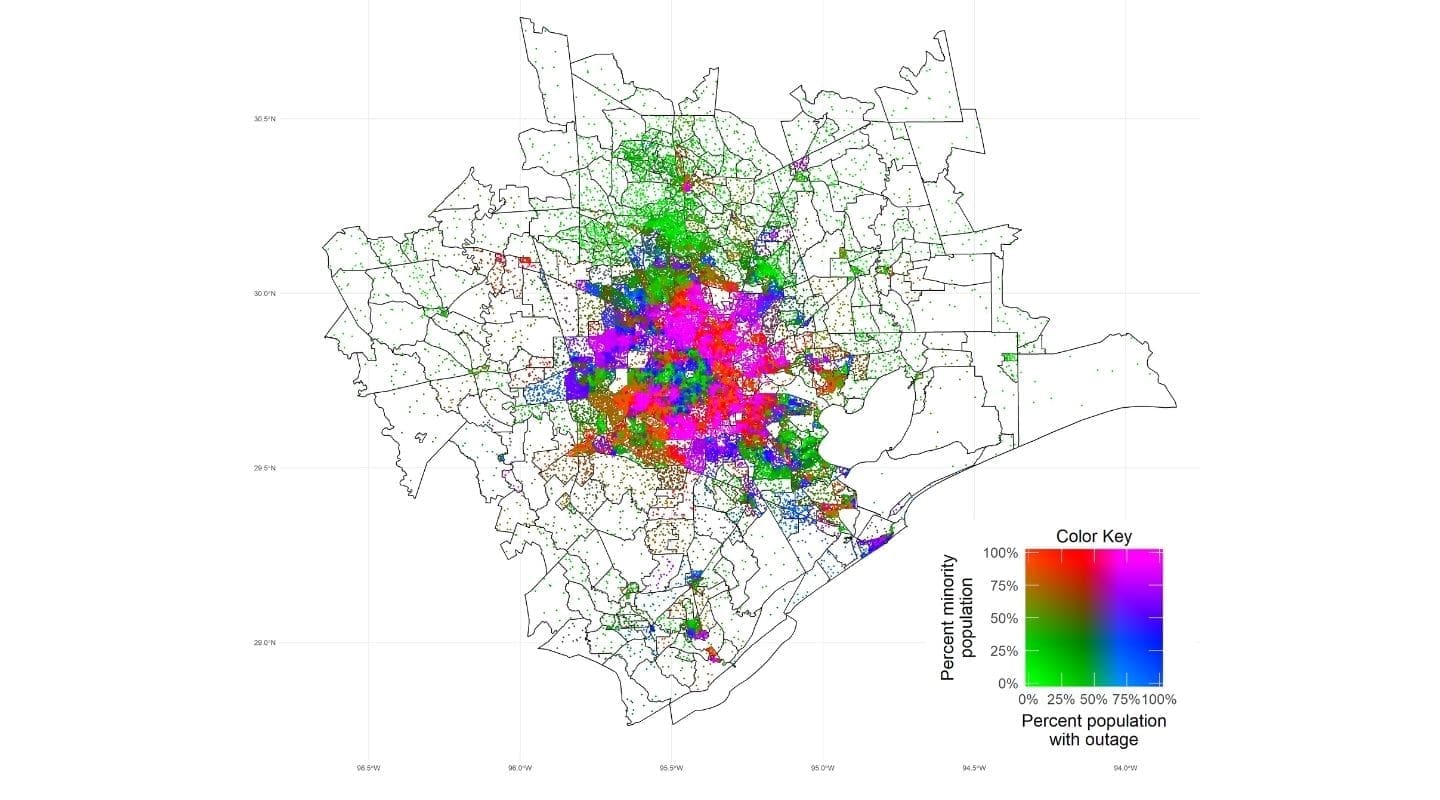
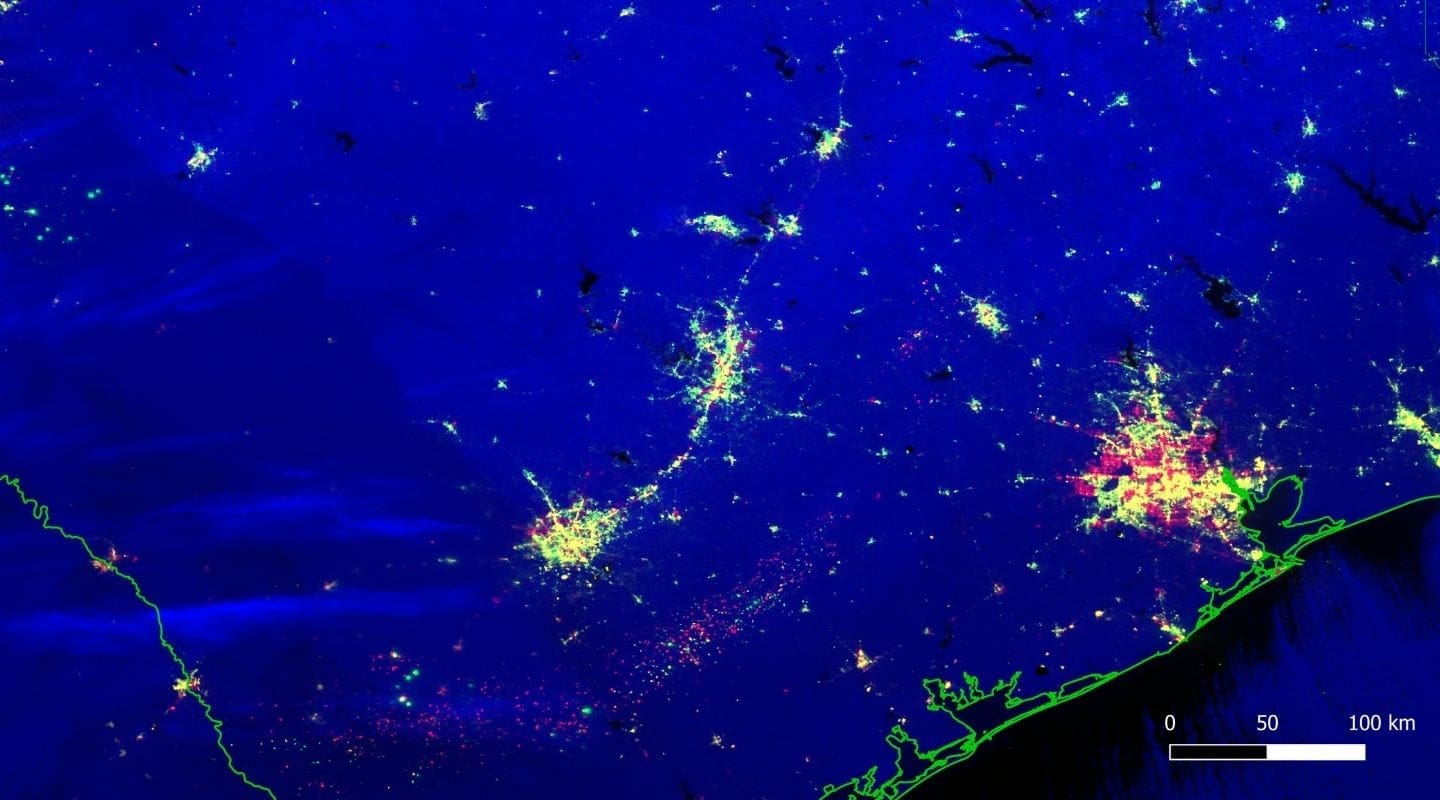
There is no publicly-available blackout data, and even if it were available it would most likely be aggregated at a level that conceals the differences in minority and low-income populations (for example, the best available data source on blackouts — PowerOutage.US — collects utility-reported data at the county level). Our approach relies on using satellite data on nighttime light illumination before, during, and after the storm in order to track changes in illumination that indicate likely electricity blackouts. We then aggregate all of the satellite data into Census Block Groups (CBGs), a unit of area used as part of the U.S. Census. While counties in Texas can range from thousands to millions of residents spread over thousands of square miles, CBGs in Texas are much smaller, typically with fewer than 2,000 people each. We can visualize the locations of minority populations and the blackouts experienced, as seen for the Houston Metro Area in Figure 1. Our blackout measurements produce similar results to the utility-reported data at the county level across the entire state. A technical description of our approach is provided below.
With the blackouts detected throughout Texas, we then use data from the EPA’s Environmental Justice Screening and Mapping tool to identify the share of population in each CBG that belongs to a minority and that qualifies as low income. Low income population is defined as the number of a block group’s population in households where the household income is less than or equal to twice the federal “poverty level.” Minority is defined as the number of individuals in a block group who list their racial status as a race other than white alone and/or list their ethnicity as Hispanic or Latino. In the chart below we show the share of population in blackout for the first, third, and fifth quintiles — the least, medium, and high minority CBGs, as well as the poorest, medium income, and wealthiest CBGs. Note that this data does not indicate the causes of the blackouts: it shows the association between those residents suffering a blackout and the two demographic characteristics.
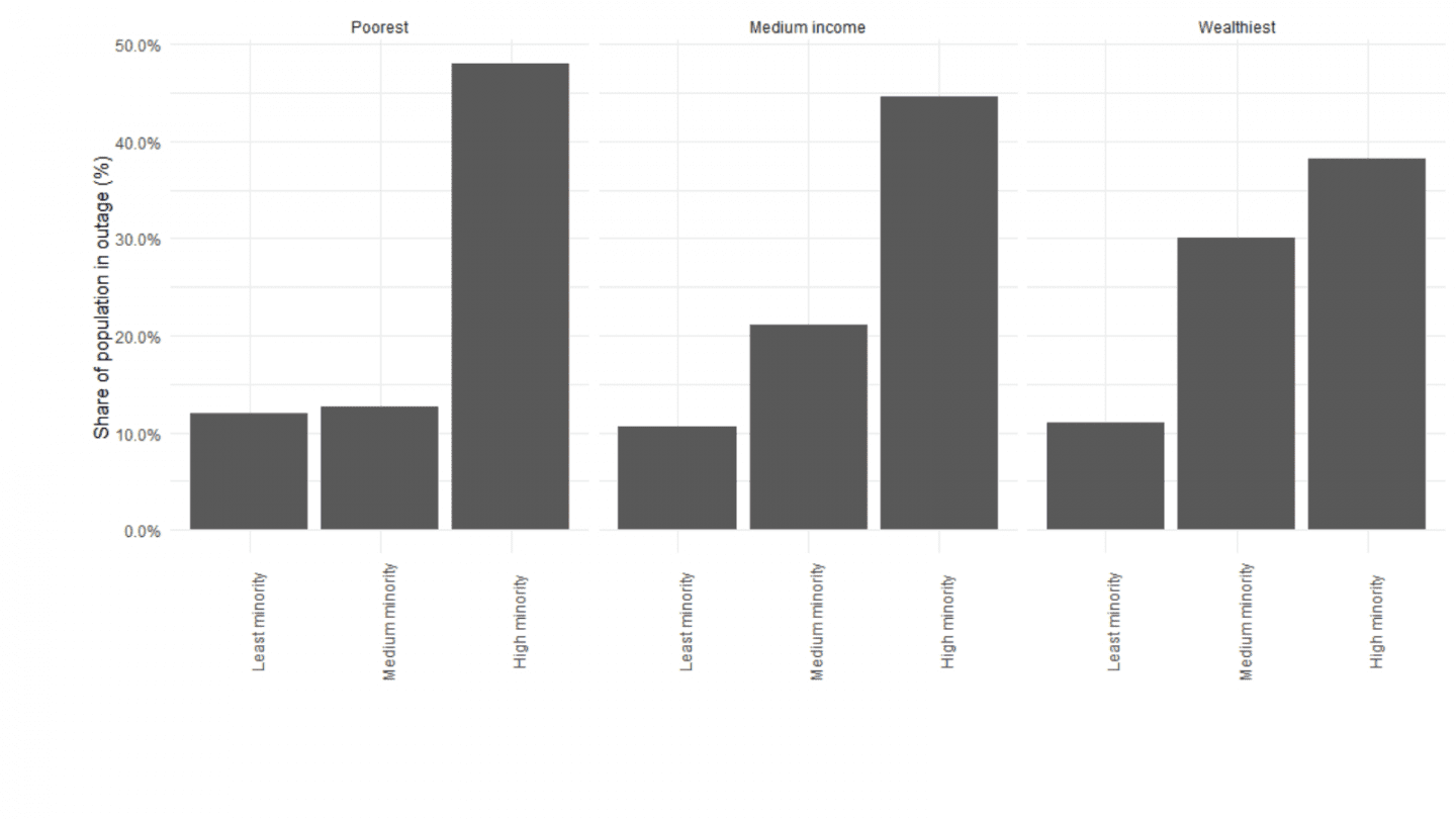
Our results in Figure 2 show that a wealthy CBG with a high share of minorities is roughly three times as likely to suffer a blackout than a CBG of the same wealth level but with a low share of minorities. For poor CBGs this difference is about four times. Conversely, a poor CBG with a high minority population is just twenty percent more likely to suffer a blackout than a wealthy CBG with a high minority population. These results show that the share of minorities is more strongly correlated with CBGs suffering blackouts as compared to poverty. About 10%-11% of the population in predominantly white areas suffered a blackout compared to a 47% in high minority share areas. This means that areas with a high share of minority population were more than four times as likely to suffer a blackout compared to predominantly white areas.
Location of critical facilities — including hospitals, police and fire stations, water and wastewater treatment facilities — can affect the actions of utilities during rolling blackouts. Texas law dictates that areas with these critical facilities should be prioritized to not experience blackouts. We find that about 22% of the CBGs in Texas contain at least one of these critical facilities, but their distribution is very skewed (Figure 3). In poor and middle income areas, predominantly white CBGs have over four times as many critical facilities per 1000 people as compared to CBGs with a higher share of minorities. A critical facility in a CBG reduces the odds of that location of suffering a blackout between 0% and 6% for different quintile combinations. This reduction suggests that high shares of low-income and minority populations remain strongly correlated with higher odds of blackouts, even when accounting for critical facilities. Further, we note that the blackouts across Texas affected a larger proportion of the population in the southern region of the state than elsewhere; this region tends to have more minority-heavy communities. Still, our results showing disparity among communities remain true even within metro areas.
In total, our results do not explain differences in blackouts — this analysis is only a diagnosis that shows the correlation of suffering a blackout with these two demographic factors. The end result — that populations in minority-heavy areas endure more widespread blackouts — is tragic and unacceptable. While innovative datasets like satellite nightlights can highlight this inequity, a failure of this magnitude is a reminder that investment in infrastructure reflects investment in communities and people. Regulators and policymakers should strive to track blackout events at the most granular level possible to identify systemic biases, and develop sound policy to eliminate them and limit disparate impacts on communities.
Figure Appendix
Technical Appendix – Nighttime Lights Data Processing
We used a collection of monthly nightlight (NL) composites for the entire region of Texas from August 2020 to January 2021, i.e., from 6 months preceding the month of outages to create a baseline dataset. Mean and standard deviation of radiance of every pixel were calculated to create two baselines – mean baseline and standard deviation baseline. These two baselines are used as reference for all the computations in this work.
We divided February 2021 into three different periods for analysis with respect to the baseline – pre-storm (February 1 to 7), storm (February 15-19) and post-storm (February 20-22). Daily NL radiance data was collected for each period and then averaged to create 3 different composites – pre-storm, storm, and post-storm. Before averaging data, we masked all the pixels that had very low radiance (<=1nW/sr/cm^2) in the January 2021 composite. Lunar illumination has a significant impact on low-radiance pixels and so masking was done in order to avoid the impact of lunar illumination on our analysis. Averaging was performed on masked daily data to create 3 different composites: pre-storm, storm, and post-storm. Each composite represents average radiance levels observed during the mentioned period. We used aggregates of daily NL data instead of raw daily NL data to compensate for the loss of data due to varying clouds across different regions of Texas. Aggregation also helps with reducing the overall noise in the daily NL dataset, and thereby allows us to study the changes in NL dynamics before, during, and after the storm with respect to the baseline levels. We note that a small number of pixels were missing in the final pre-storm, storm, and post-storm composites owing to the presence of clouds on them during the entire composite period.
Intuitively we expected the Texas region to get darker during the storm period because of loss of lighting due to widespread outages, but in many cases, we observed the exact opposite situation: much of Texas had become significantly brighter during the storm period relative to its normal brightness levels. Overall NL radiance of Texas observed in the storm composite was significantly higher than its radiance levels during months with no storms – August 2020 to January 2021. We found that Texas’ total nighttime lights (TNL) – sum of NL radiance of the entire region – during the storm was 1.35 times the TNL value during January 2021. This sudden increase in brightness levels despite the presence of large-scale outages can be attributed to snow. Reflection of light by snow caused the overall region to appear brighter than usual. Therefore, as a simple correction for snow, we calculate this TNL ratio for each county and, for counties that experienced snowfall during the storm and exhibited a spike in radiance, we divide the radiance values of all pixels in the storm composite by the ratio computed for each county.
We selected z-score as a metric to compare and study the changes in NL during the pre-storm, storm, and post-storm period with respect to the baseline for each pixel. It is important to compare a pixel only to its own past behavior as the lighting in each pixel is mostly independent of its neighboring pixels. For each of the three February 2021 composites, we computed z-score for every pixel as follows:
Z_p = (rad_p – mean_p)/(std_dev_p)
where, Z_p = z-score of a pixel “p”, rad_p = radiance of pixel “p” in February composite, mean_p = baseline mean of pixel “p”, and std_dev_p = standard deviation of pixel “p”. Z-score value for a pixel provides how many standard deviations is its radiance away from its mean. Positive z-score for a pixel indicates an increase in radiance of the pixel w.r.t its mean which corresponds to the pixel getting brighter. On the other hand, a negative z-score of a pixel indicates a pixel getting dimmer. Using this technique we create pre-storm, storm, and post-storm z-score maps of Texas in which each pixel value now represents a z-score value and not raw radiance.
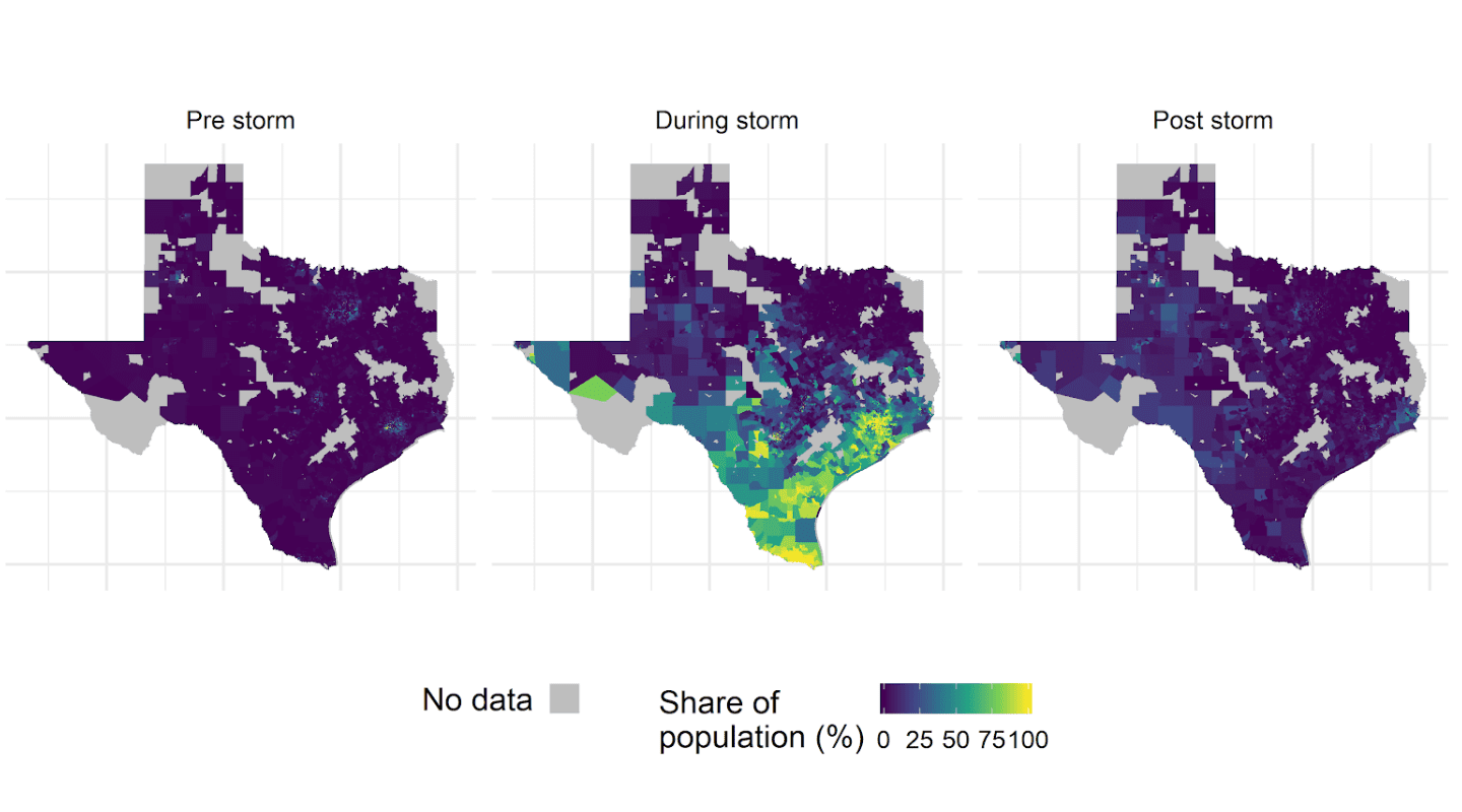
The spatial resolution of z-score maps was equal to 15 arc-seconds, which is approximately 450 meters at the equator. We aggregated z-score maps at the CBG level by computing the proportion of pixels in a CBG that exhibited an extremely low z-score value of less than or equal to -2 (i.e., two standard deviations below the pixel mean). In other words, we computed the proportion of pixels in a CBG whose radiance was significantly impacted by the outage. It is based on the assumption that extremely low z-scores are indicative of the presence of lighting outages on the ground. This step provides us with a proportion of pixels in a CBG that experienced a significant drop in their z-scores during pre-storm, storm, and post-storm period. We assume that the proportion of pixels in a CBG with extremely low z-scores is representative of the proportion of customers impacted by the outage in that CBG. The output of this step is shown in the headline figure of the main post which represents the share of population throughout Texas impacted by an outage during pre-storm, storm and post-storm periods. It is important to note that the technique described here produces a number of false positives because NL data is noisy by nature and that is the reason behind the presence of impacted customers in the pre-storm composite shown.
We multiplied the proportion of customers impacted in a CBG with the total number of customers in the CBG (obtained from the EJSCREEN dataset) to obtain the absolute number of customers impacted in a CBG. Using this technique we were able to detect that approximately 3.1 million customers were impacted by the outages during the storm period (February 14-19, 2021). While this is fewer than the number reported by PowerOutage.US, the best available public data, which is collected directly from electric utilities in the region, these two datasets were collected at slightly different times. Further, the composite dataset can be understood as measuring sustained outages that persisted throughout much of the storm period. Furthermore, by multiplying the total number of affected customers in a CBG with the proportion of low income and minority customers in that CBG, we were also able to obtain the number of impacted customers that belonged to low-income and minority categories.
Output Validation
We used utility reported county level data collected by PowerOutage.US and published in the Texas Tribune. Published county-level data was collected on February 16, 2021 between 10-11am local time and is a comparison dataset for our work. According to this data a total of 4.6 million customers were impacted by the outages, which is more than the number detected by our NL-based technique (3.1 million). Based on differences in when the PowerOutage.US data were collected and when the VIIRS data were collected as well as differences in our methodologies for determining outages, we do not expect these two datasets to align perfectly.
We aggregated CBG-level storm composite data to the county level for us to be able to compare our results with PowerOutage.US reported county-level data.
(1) Comparing total number of customer-outages at county-level
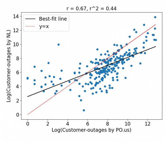
This figure shows a scatter plot of log of total customer-outages detected by our NL-based technique to the log of customer-outages reported by PowerOutage.US. Correlation between the two is equal to 0.57. While this reflects general agreement between the two datasets, we further investigate discrepancies below.
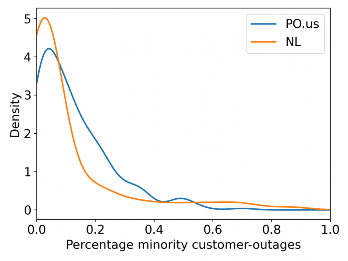
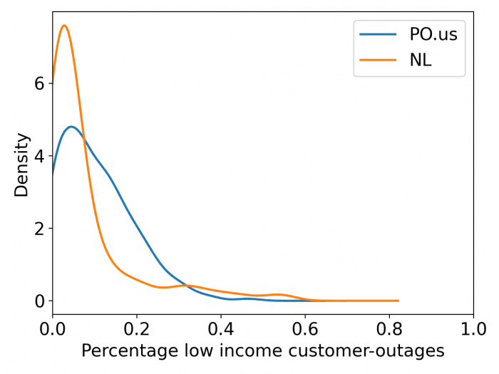
(2) Comparing minority and low-income customer-outages at county-level
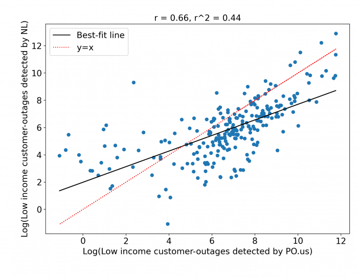
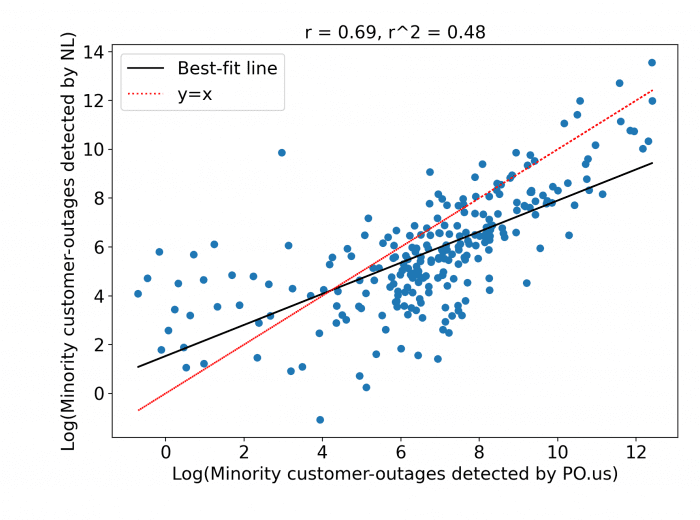
Log of low income customers detected by PowerOutage.US and NL are 66.8% correlated and Log of minority customers detected by PowerOutage.us and NL are 71.3% correlated. In this case we underestimate the number of impacted low-income and minority customers also. The relatively equal performance among different segments of the population indicate that our technique does not exhibit bias towards specific groups in its agreement with PowerOutage.US data.
(3) Density plot with percentage of customer-outages per county
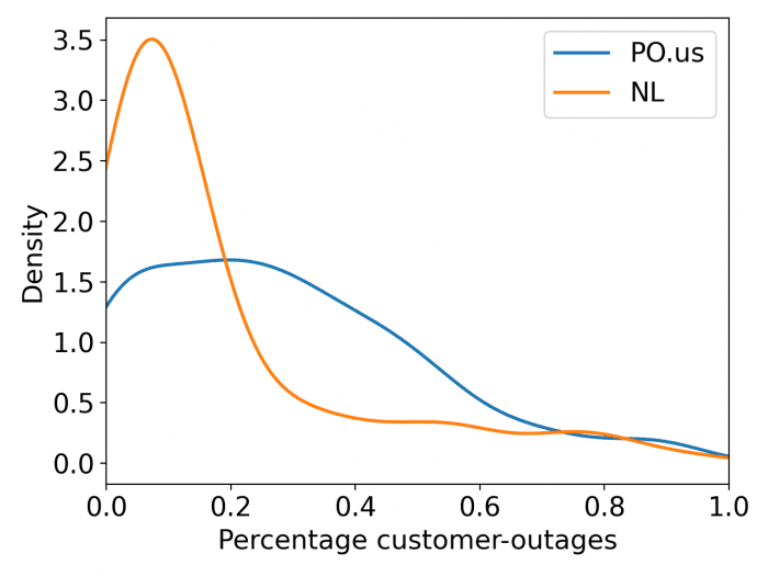
Our method tends to produce more extremes. Our method detects counties with widespread outages well (i.e., those with > 50% customers), but does not do as well with counties moderately impacted.
Related Updates
The Modern Energy Minimum
The evidence is clear: to truly empower people to live better lives, reach the middle class, and be resilient to climate change, we must raise our global energy ambitions.
More